Highlight important messages with a visual spotlight
This feature only offered with Confluence Cloud Premium and Enterprise.
Spotlight allows you to present important message with a large image, a colorful background, and an interactive link.
Spotlights call attention to key messages by presenting Confluence, Jira, and Atlas links or external URLs as large presentation pieces. Craft your messaging and add upload an image or choose one from our library.
Spotlights are also a useful design element to communicate to the entire organization on Company Hub.
To add a spotlight to your content:
Select (+) from the toolbar, then find Spotlight. Or, type
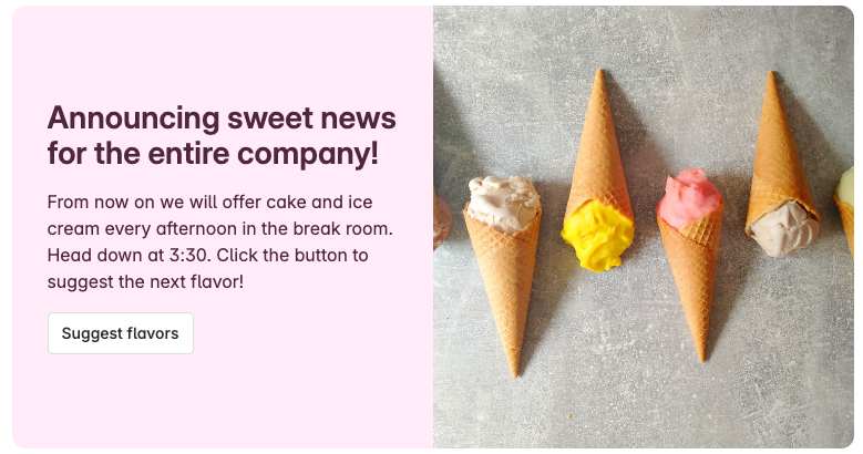
/spotlightwhile editing.Upon selection, a spotlight with a sample image and content will appear on your page.
Set the width of the spotlight
Select the spotlight. From the floating toolbar, select your width.
Back to center: The spotlight has the same width as the text.
Go wide: The spotlight is somewhat wider than the text.
Go full width: The spotlight goes the full width, or about three times wider than the text
Edit the spotlight
Select Edit () to open the configuration panel.
Styles tab
The Styles tab lets you select a background color, text color, and a layout.
To change the background color, select the drop-down swatch and choose one of the available colors. You can also enter your own custom HEX, RGB, or HSL values.
To change the text color, select the drop-down (letter A) and choose one of the available colors. You can also enter your own custom HEX, RGB, or HSL values.
The color pickers will let you know if your color values pass accessibility standards. This means the text and background color combination should work well for everyone.
To change the layout, select the Layouts expand. There are three layout options:
Split design: A large image takes up the full height of the spotlight on either the left half or right half.
Solid color background: The text is centered in the spotlight and there is no image.
Content tab
Use the Content tab to add a title, description, an image, and a button with a link.
Input your title to customize the large display text. Depending on the layout and number of characters, your title will display as one, two, or three lines.
Input your primary message in the description field. Depending on the the layour and number of characters, your description will be between one and five lines.
Select an image from the image drop-down menu. You can upload your own high resolution image (1,200 pixels or wider) or input a search term to select from the Unsplash image library.
Select the Button to add a link to the spotlight. Configure the button with a link (this can be an internal Confluence link or any external URL) and a very short message instructing people to interact with the button.
Buttons are optional. Use the trash can icon to delete a button from the spotlight.
Use layouts to enhance your spotlights
You can get a different look when you combine them with different column layouts.
From the toolbar, select the layouts icon, or type /layout to choose from two, three, four, or five columns. You can then add spotlights and other elements and content to each column.
Was this helpful?