Layouts and options
Views and layouts
Layouts can be saved as part of a view. For more information on creating and using views, check out our page on Database views.
Databases aren’t available in the Atlassian Government environment.
There are three different ways to visualize your content within a database. Here's an overview of each layout:
Table layout: This is the most traditional way of viewing a database. It allows you to see entries in your dataset as rows, with every field represented by a column. When creating a new database, the default all entries view will use the table layout.
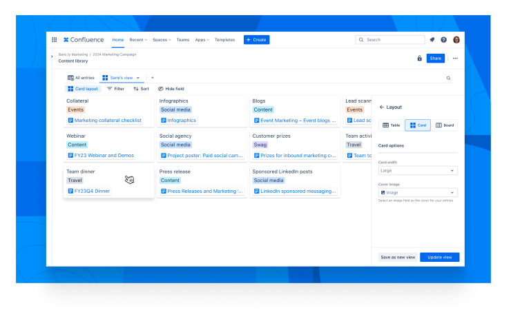
Card layout: Display your entries as separate cards. This layout is best for visual content, such as when creating a people directory.
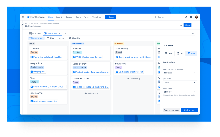
Board layout: This view groups your items by a tag field. For example, it can be used as a Kanban board to move an item through process phases.
Each layout offers additional settings to define a specific look and feel:
Card width — Defines a minimum and maximum width for your cards (based on your browser window size).
Cover image — This setting sets an image field type or a page header image (based on a page link field type) as the cover of your card.
Table
A table layout is the classic way to view a database. It offers a structured grid of rows and columns. Each row represents an entry, and each column corresponds to a field in the database.
Rows
Each row in the table is an individual entry containing values that correspond to the fields set for each column. The type of value depends on the field type defined for that column.
Add rows
You can add new entries to your table in several ways:
Add entry: Select the + Add entry option at the bottom of the table.
Insert row: Hover between rows and select the Insert row option that appears.
Menu options: Select a cell or row, then use the Insert row above or Insert row below options from the table's top menu.
Row options
A handle icon (⋮⋮) appears to the left when you hover over a row. Select this icon to access the following options:
Expand entry: This option displays the entry details in a side panel, allowing you to copy a link or delete the entry.
Insert row above: Add a new row above the selected row(s).
Insert row below: Add a new row below the selected row(s).
Duplicate: Creates a copy of the selected row(s).
Delete: Removes the selected row(s).
Columns
Each column represents a field in your database. You can customize these fields as described in the Database fields.
Rearrange columns and rows
You can change the order of your table's rows and columns using drag-and-drop functionality:
For rows, hover, then select and hold the
⋮⋮icon on the left to drag it up or down.For columns, select and hold the
:::icon to drag them left or right.Resize columns by hovering over their edges in the heading row and dragging right or left.
Number your entries/rows
Numbered entries help to better organise your database and make referencing entries easier for your team.
To enable numbered entries:
Navigate to View settings by going to Edit view from a view’s dropdown.
Select Table.
Under Table options, toggle Number entries on.
Card
The card layout displays databases with visual components like office directories, mood boards, and more. Selecting a card from the database expands the entry and shows the details in a side panel.
Card layout options
When using the card layout, you can configure the following options:
Card width: Choose the width of the cards. Available options are:
Small
Medium
Large
Cover image: Select an image or page title field to display as the cover image for cards. If you select a page title field, it will use the page's header image.
Adding a new card
To add a new card to your database, follow these steps:
Select the + Add entry option at the end of the card list.
Board
Board layouts help show items in a database moving through process stages or grouped by property. Selecting a card from the database expands the entry and shows the details in a side panel.
Board layout options
When using the board layout, you can configure the following options:
Group by: Select a tag field to group your entries by. These groups will create the columns on your board.
Card width: Choose the width of the cards. Available options are small, medium, or large.
Cover image: Select an image or page title field to display as the cover image for cards. If you select a page title field, it will use the page's header image.
Adding a new card
To add a new card to your board, follow these steps:
Select the + Add entry option at the end of any column. This will add a new entry card to that column.
Reorder cards
Change how cards on your board are ordered with drag-and-drop.
Select, hold, and drag to move cards up and down or between columns.
Add a new column
To add a new column to your board:
Select the
+option beside the last column.Select + Add item under Selectable items.
Please select a color for the new tag and give it a name.
A new column will be added for each tag.
Was this helpful?