Create a chart
There are two ways to create a chart:
Use a template to create a pre-built chart.
Use the chart editor to create a custom chart.
To create a chart using either of these methods, start by doing either of the following:
Select Create > Chart from the global navigation.
Select Add chart from a dashboard’s sidebar.
Create a chart from a template
A chart template has predefined queries and transformation steps to help you get answers quickly.
Chart templates are only available for Atlassian Data Lake connections that include “All” data as the scope of data.
To create a chart from a template:
Select Create > Chart from the global navigation or Add chart from a dashboard’s sidebar. A pop-up will appear.
Select one of the templates from the left sidebar. You can filter by app or search for specific keywords in the chart titles and descriptions.
Select Configure chart.
Select an Atlassian data source to use to populate the chart’s data.
Select the dashboard to place the chart on.
Select how you want to filter the chart. Refer to the next section to learn more about how filters for chart templates work.
Select Create chart.
You’ll then place your new chart (and controls, if any) on the selected dashboard. Once you’ve placed your chart, you can edit and customize it further to fit your needs.
Filter using recommended controls
Most templates have a section to configure filters for the chart. For each filter, you can choose to connect an existing control on the selected dashboard, create a new control of a recommended type, or not filter at all–but we think you’ll get the most value from the template if you use the filters. Learn more about controls.
If you have any existing controls on your dashboard that are set to automatically connect to new charts, they may connect to your chart and affect its results. After placing the chart on your dashboard, edit it to remove any unwanted query filters.
Create a custom chart
Create a chart from scratch to answer specific questions that our chart templates might not cover.
To create a custom chart:
Select Create > Chart from the global navigation or Add chart from a dashboard’s sidebar. A pop-up will appear.
Select Custom chart.
Select Go to chart editor. This will take you to the chart editor. Learn more about the chart editor.
From the chart editor:
Query the data required for the chart using either visual mode or SQL mode.
Transform the queried data using other Visual SQL steps. View the available Visual SQL steps.
Customize your chart.
Select a chart type.
Select Chart settings () to modify the chart settings, which will vary based on the selected chart type.
Select Save to dashboard to save the chart to a new or existing dashboard.
It’s not required to save your queries as a chart. Use the chart editor to run ad hoc queries too.
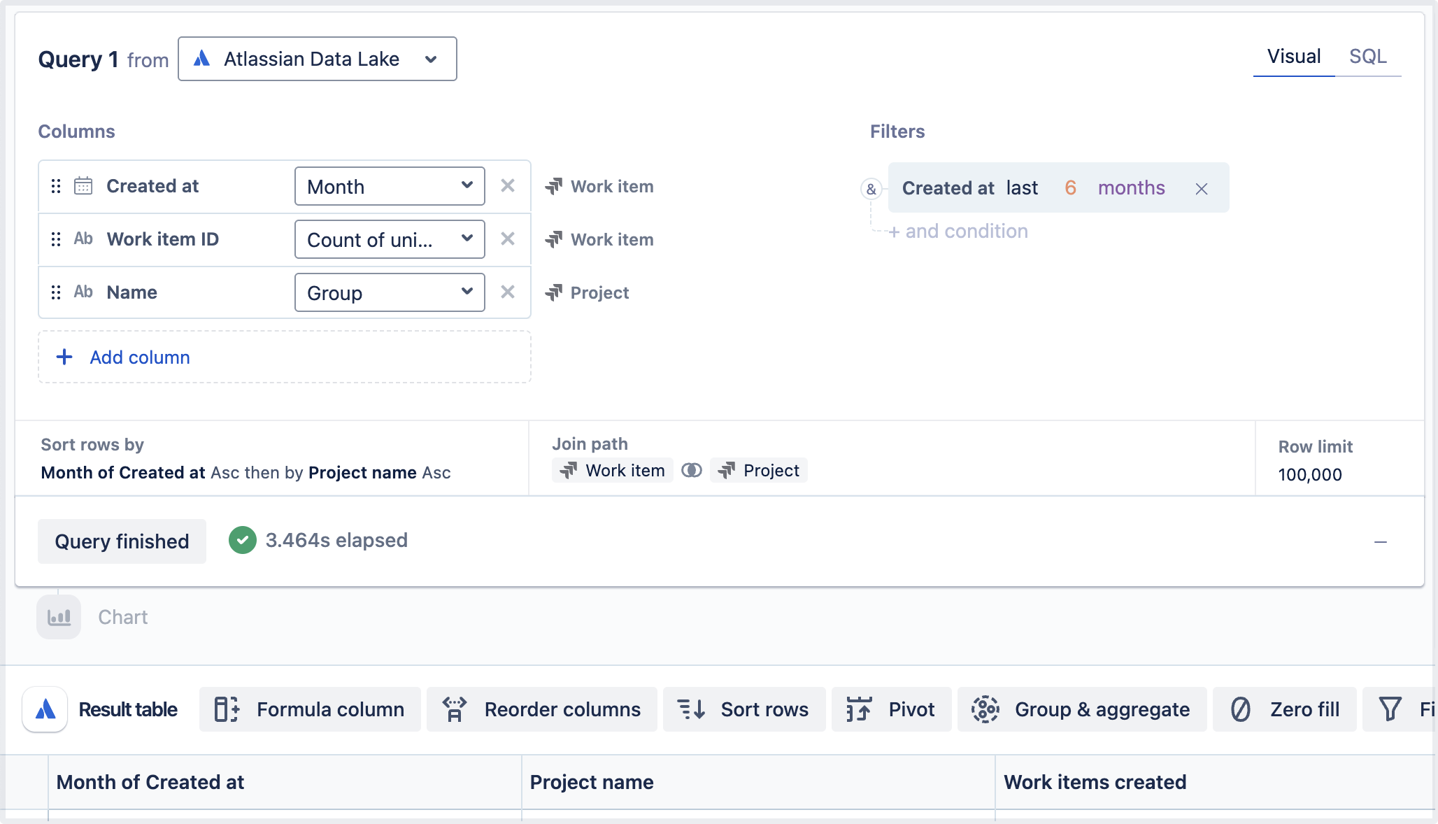
Chart example - Work items created per project
To help you get started, we’ll show you how to create a chart that shows the number of Jira work items created per project over the last three months.
Follow the steps mentioned above to go to the chart editor.
Select Visual for the type of query.
Select the data source you want to query. For this example, we selected a data source called Atlassian data, which connects to the Atlassian Data Lake and lets us query our Jira data.
Under the “Columns” section of your query, select Add column and add the following columns to the query with the recommended aggregations:
Created at from the Work item table under “Jira family of apps.” Select Month from the aggregation menu.
Work item ID from the Work item table under “Jira family of apps.” Select Count of unique from the aggregation menu.
Name from the Project table under “Jira family of apps.” Select Group from the aggregation menu.
Optional: Select the column names in the result table and rename them. We renamed the Name column to Project name and the Count of unique Work item Work item ID to Work items created.
Under the “Filters” section, select Add filter and add the following filter condition:
Created at from the Work item table under “Jira family of apps”
last N interval
Enter 3 for the number
Select months for the interval.
Optional: Increase the row limit of the query. We increased ours to 100,000.
Select Run query.
By default, if you haven’t selected a specific chart type, the Analytics app will automatically select a chart type based on the final shape of your data. We renamed our chart to Work items created per project, and this is how our final query, data, and chart looked:
Was this helpful?