Visual SQL とは
Visual SQL is where a bulk of the magic happens in the Analytics app—it’s what you’ll use to create your charts. It’s the full series of query and transformation steps taken to achieve your final chart. As the name suggests, we’ve made SQL visual, to empower users of all backgrounds to explore their data. It’s intuitive for business users, fast for power users, transparent for SQL pros, and flexible for programmers.
新しいチャートを作成するとき、Visual SQL はビジュアル モードの拡張クエリ ステップから始まります。そのステップで、最初のクエリを編集して実行します。そこから、クエリ結果を他の Visual SQL ステップで変換し、その変換の結果セットを表示して、最終的には、そうした結果を視覚化してダッシュボードに追加したり、他の人と共有したりできます。
Visual SQL is also used to create other resources in Analytics, such as “Dropdown” controls and “Date slider” controls. Learn more about controls.
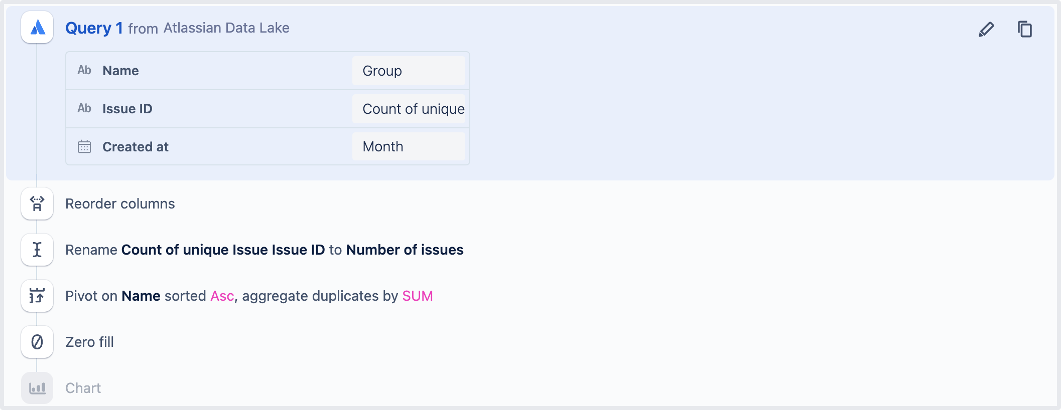
上の画像は、一連の Visual SQL ステップの例を示しています。最初は「クエリ」ステップ、次に「列の順序を変更」ステップが続きます。その後は「列の名前を変更」ステップ、次に「ピボット」ステップ、そして「ゼロ埋め」ステップ、最後に「チャート」ステップと続きます。
この内容はお役に立ちましたか?