Compare time periods in a single value chart
Platform Notice: Cloud Only - This article only applies to Atlassian apps on the cloud platform.
Summary
Atlassian Analytics gives users the ability to easily compare one period of time to a relative previous period of time, for example, week-over-week, month-over-month, year-over-year, etc.
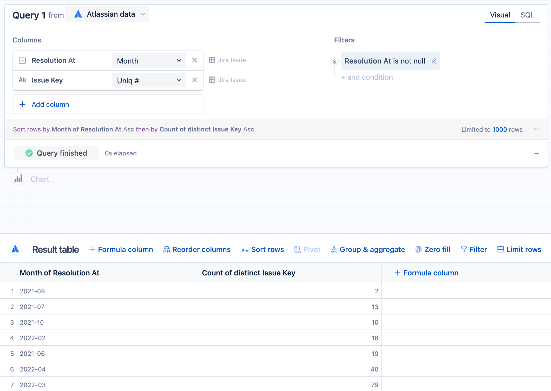
Begin by creating a table that compares one month’s data to the previous month’s data as a basic starting point. For this example, we’ll use the Atlassian Data Lake data source to compare this month’s number of resolved tickets to last month’s number of resolved issues.
Create a month-over-month (MoM) table by opening the Jira Issue table and adding the Resolution At and Issue Key columns to the Columns section.
Change the grouping for “Resolution At” to Month and aggregate “Issue Key” with a distinct count.
Add a query filter where Resolution At is not null.
Click Run query.
Add a “Formula column” step , selecting Lag as the formula type; this copies the values from one column into a new column but shifts the rows down based on the row offset number. For this example, select Count of distinct Issue Key for the column and type
1for the row offset.Click Save.
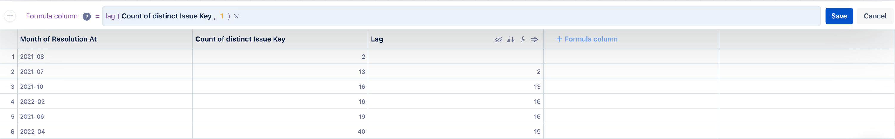
Rename the new column to “Previous month” to indicate it's the number of resolved issues from last month.
This table now has two columns that compare the current month’s number of resolved issues to the previous month’s.
Solution
Using a single value chart
There are many ways to visualize this data in Atlassian Analytics, but in this example, we’ll choose a single value chart to show us the difference between this month’s number of issues and last month’s.
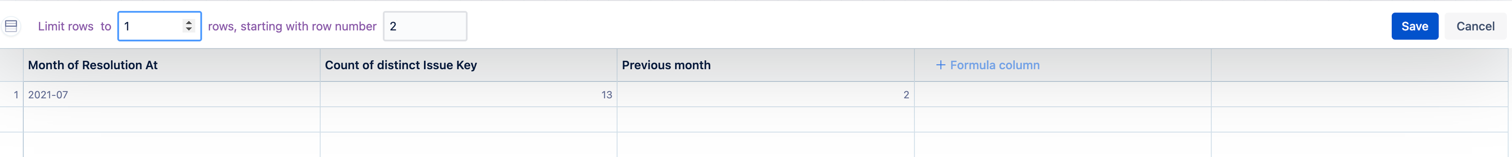
Add a "Limit rows" step to filter on just a single row of data. We’ll focus on the second row since it has values in both the current month and previous month: limit the rows to
1and start with row number2.Click Save.
To get the difference in monthly amounts, add another “Formula column” step but select Custom Formula then use the following formula:
"Count of distinct Issue Key"-"Previous month"
For clarity, we also renamed this new custom column to “MoM issue difference”.
To use the single value chart, we need to reduce the number of columns to one, so we’ll hide the first three columns.
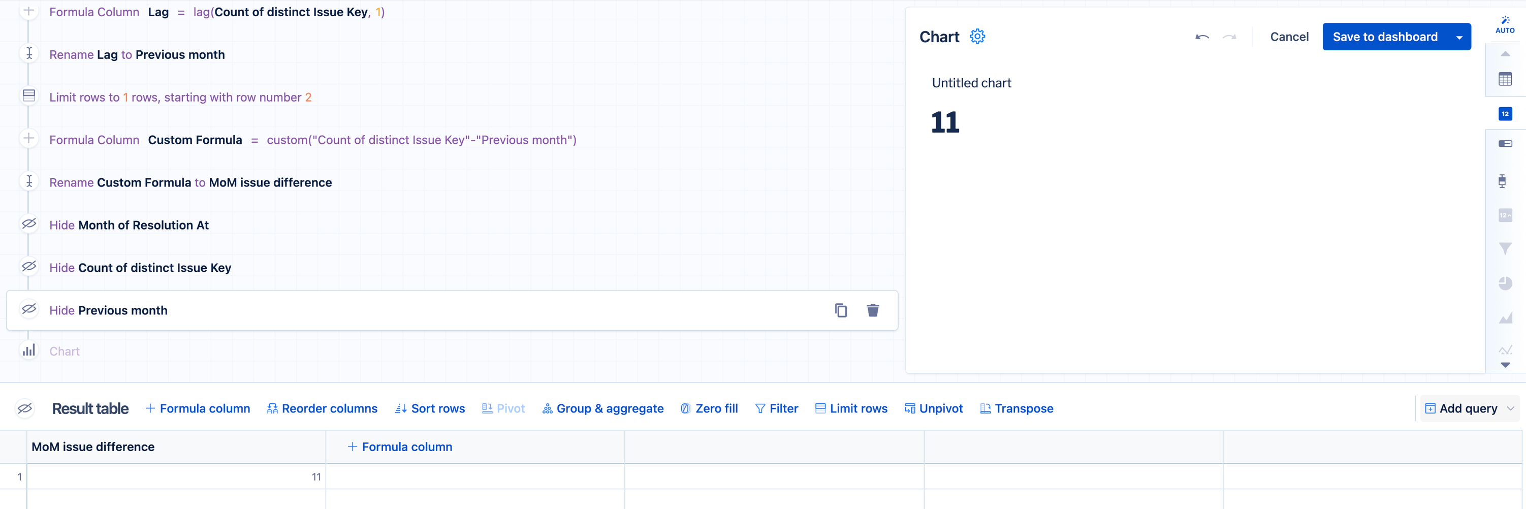
Now we can choose the Single value chart type.
This now displays the difference in resolved issues between the current month and the previous month and will update each month. Click the Gear to open the chart settings and name the chart to something like “MoM difference in resolved issues”.

Was this helpful?