Fix x-axis date labels
Platform Notice: Cloud Only - This article only applies to Atlassian apps on the cloud platform.
Summary
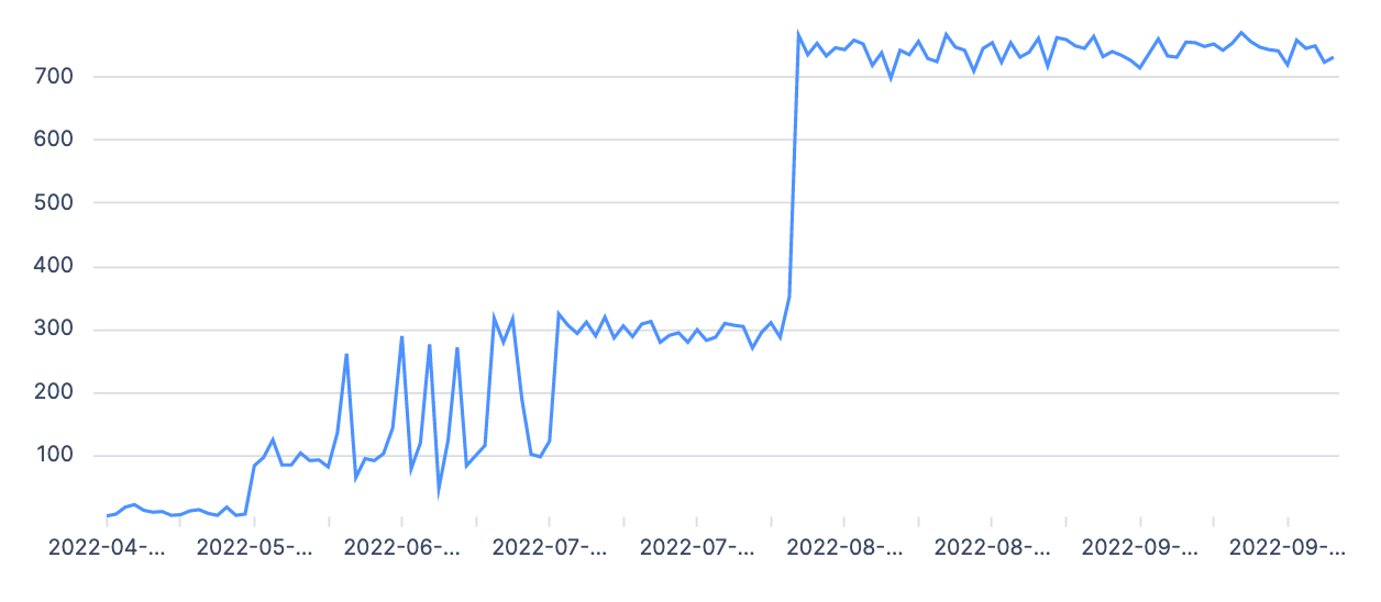
Date x-axis labels are automatically formatted in a more legible format when detected and spaced evenly along the x-axis.
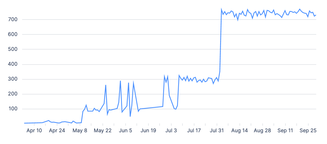
If Atlassian Analytics isn’t recognizing your dates as a time series, it won’t know that it can group the date values to display the series better. This article features some solutions you can take to resolve this.
Solution
Zero fill the data
If there are dates missing from your date series, using a “Zero fill” step will fill in the missing dates so Atlassian Analytics can recognize the dates as a series.

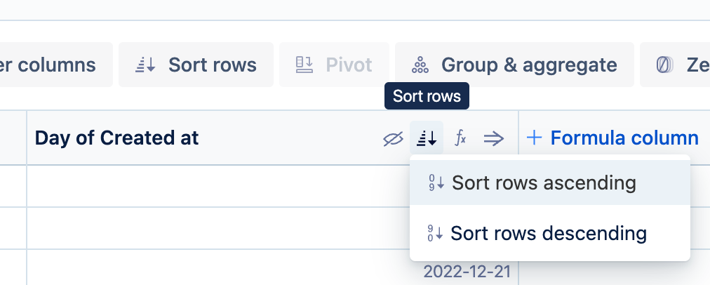
Sort your dates
If your dates are out of order, Atlassian Analytics can’t group them as a series. To sort your dates, use a “Sort rows” step on your date column and select Sort rows ascending.
Look for discrepancies in your data
It’s possible there is a null value in your dates, or your dates are not formatted correctly. View the raw data being returned to look for any discrepancies. If applicable, filter out for null dates.
To view the chart’s raw data:
Hover over the chart in your dashboard.
Select the chart’s vertical ellipsis menu.
Select View chart data.
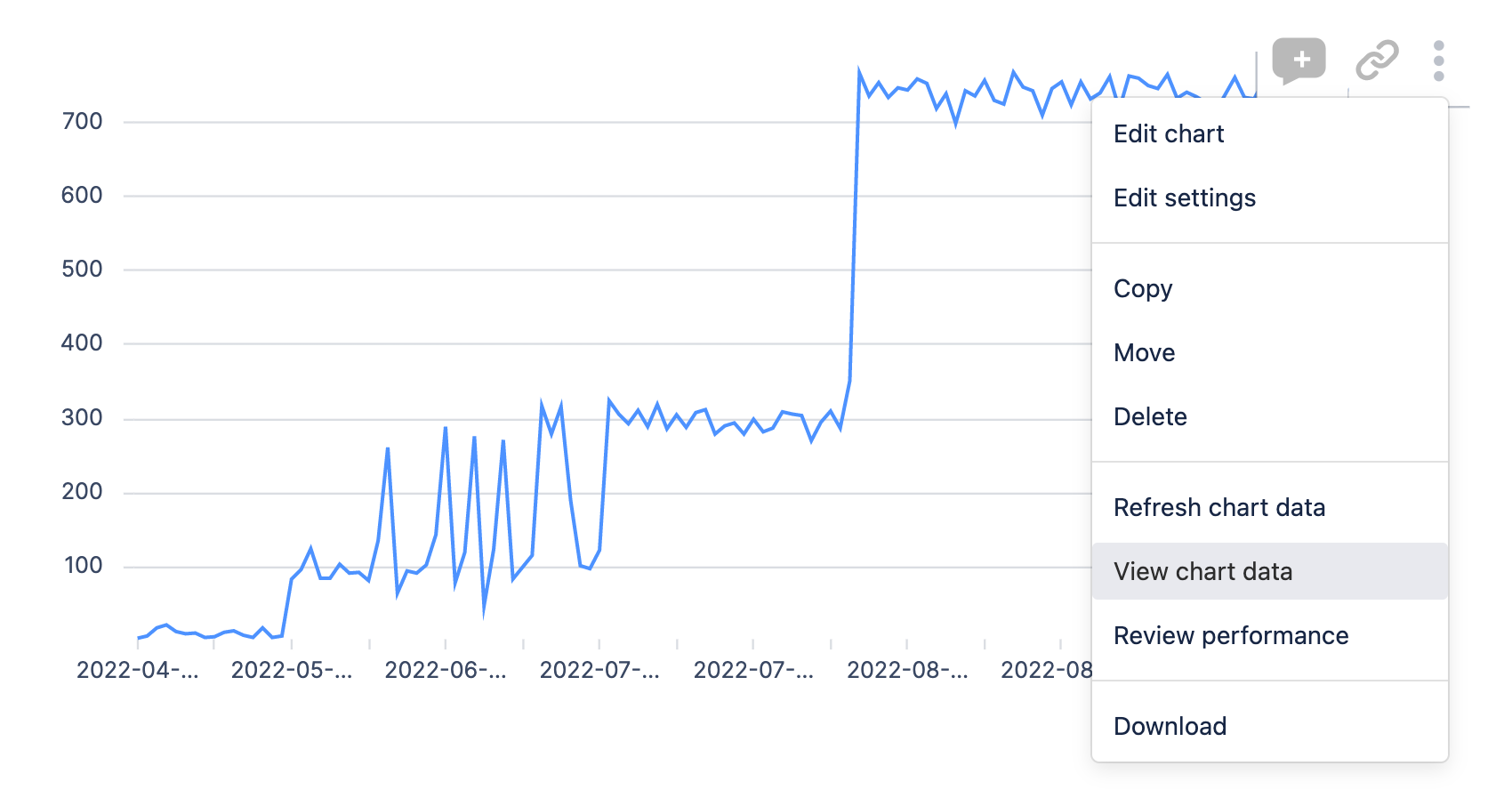
This will open up a table view of your chart’s data on the dashboard.
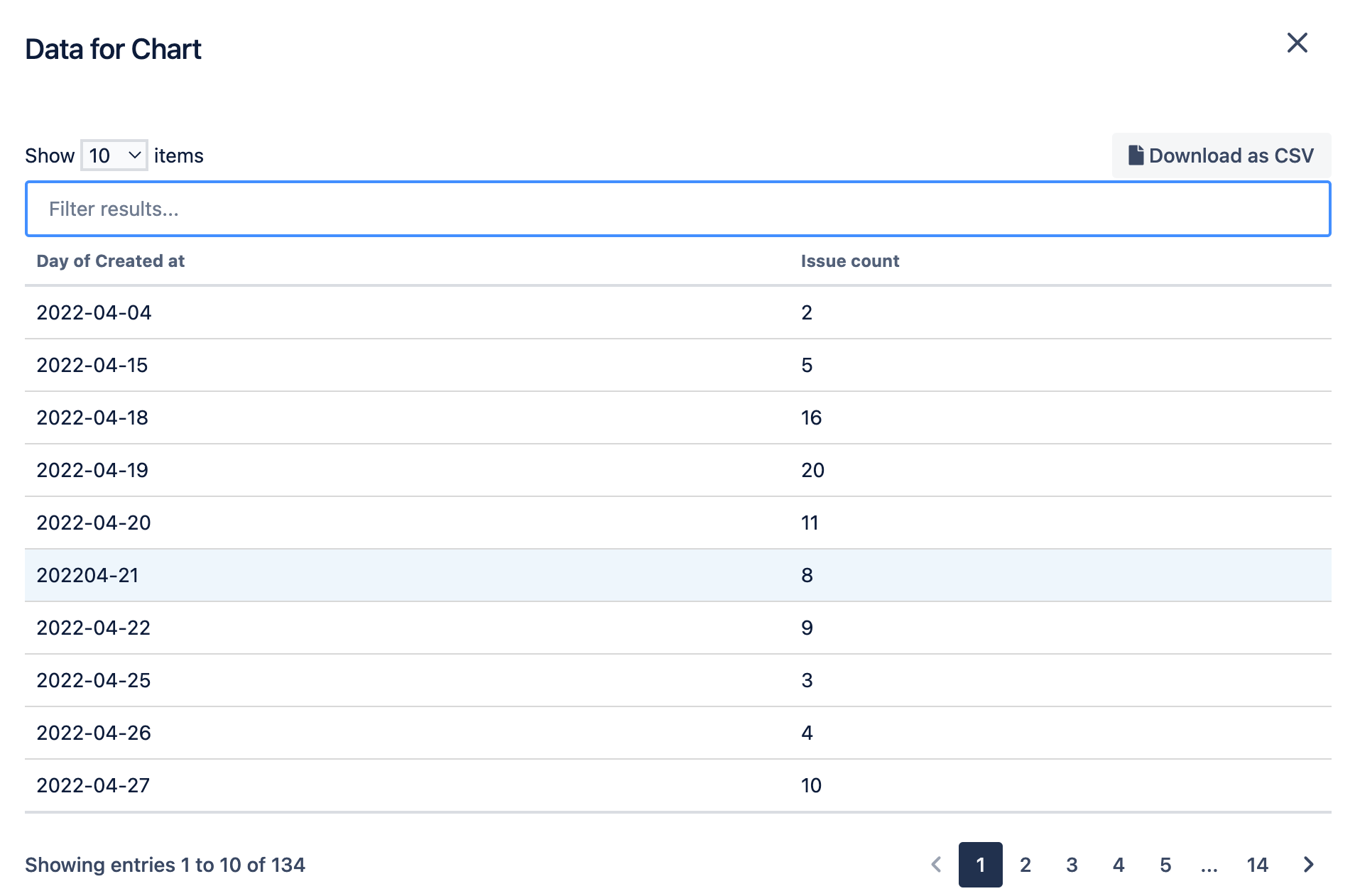
Alternatively, select Edit chart to open the chart editor, then temporarily change the chart type to Table. In the example above, you can see that one of the dates is not formatted properly and will need to be fixed in order for the chart to properly display the time series.
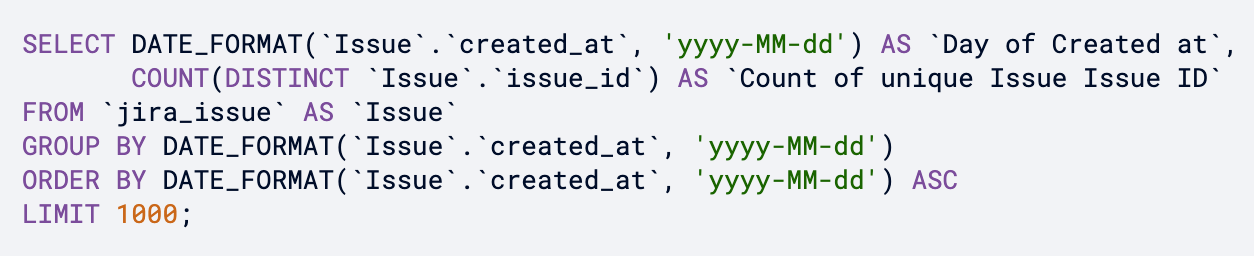
Verify date format in SQL mode
To recognize dates as dates, Atlassian Analytics requires that they are formatted in a certain way. If you’re using SQL Mode, ensure your charts are using the correct date format.
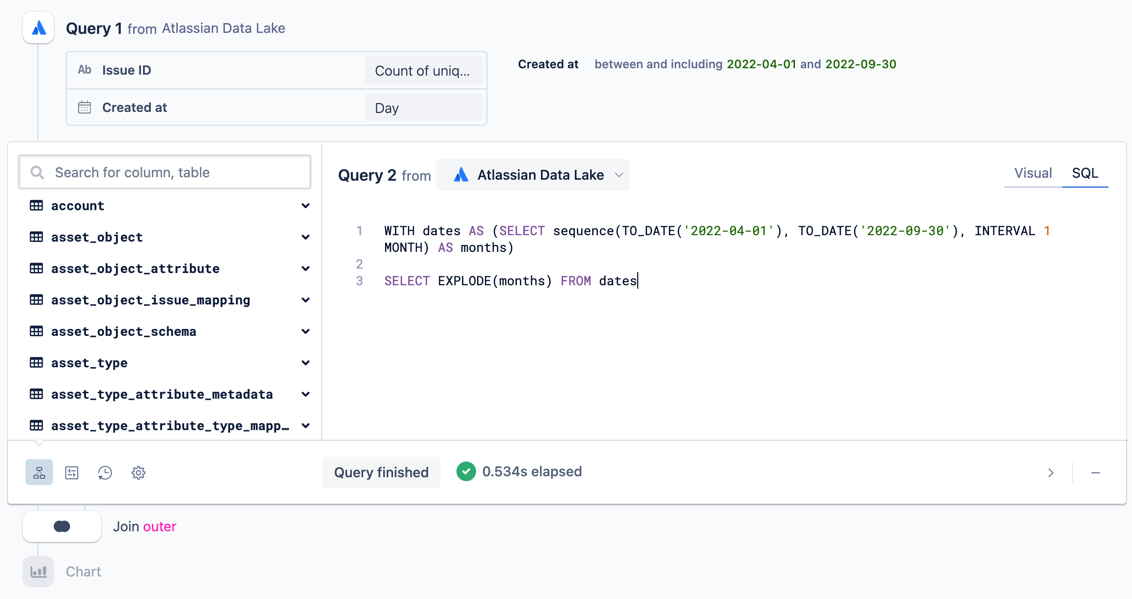
Fill the gaps with an outer join
Sometimes, the “zero fill” solution doesn’t always work. Another option is to add another query where you only pull in a single column whose values are the continuous date range you’re trying to look at. Then, use an Outer join to merge this new query with your original result set (make sure the date column is the leftmost column in your original result set). This forces a continuous date range by adding in any missing dates to your original result set.
Learn more about generating a time series in Visual SQL.
Was this helpful?