Create dynamic categorical columns on your dashboard
Platform Notice: Cloud and Data Center - This article applies equally to both cloud and data center platforms.
Support for Server* products ended on February 15th 2024. If you are running a Server product, you can visit the Atlassian Server end of support announcement to review your migration options.
*Except Fisheye and Crucible
Using Visual SQL steps, it’s possible to dynamically change between categorical columns on your dashboard. This allows dashboard viewers to select only the fields they’re interested in viewing. For this example, we’ll use an Atlassian Data Lake data source.
On the dashboard, select Add control from the sidebar and choose “Dropdown” from the options.
Switch to SQL mode, type in the following, then select Run query:
SELECT 'Project Name'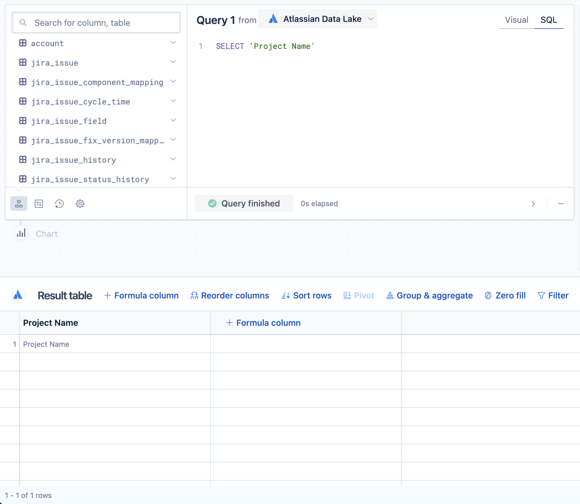
3. Add a second query by selecting Add query. Again switch to SQL mode, type in the following, then select Run query:
SELECT 'Project Type'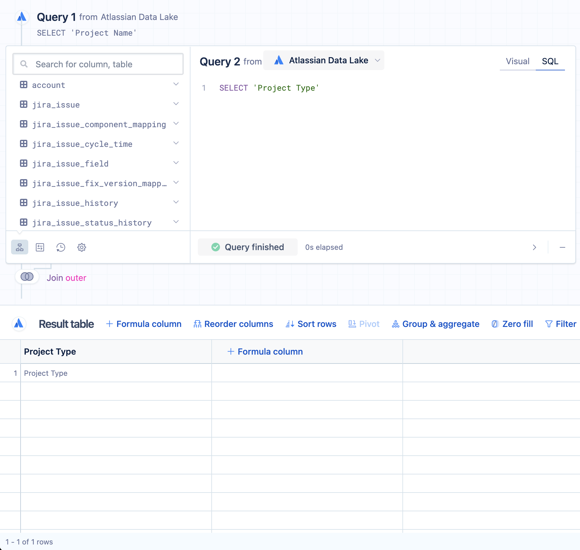
If you have more than two categories, add additional queries and SELECT statements with the additional category names. The aliases you set need to match the names exactly as they are in the table or chart.
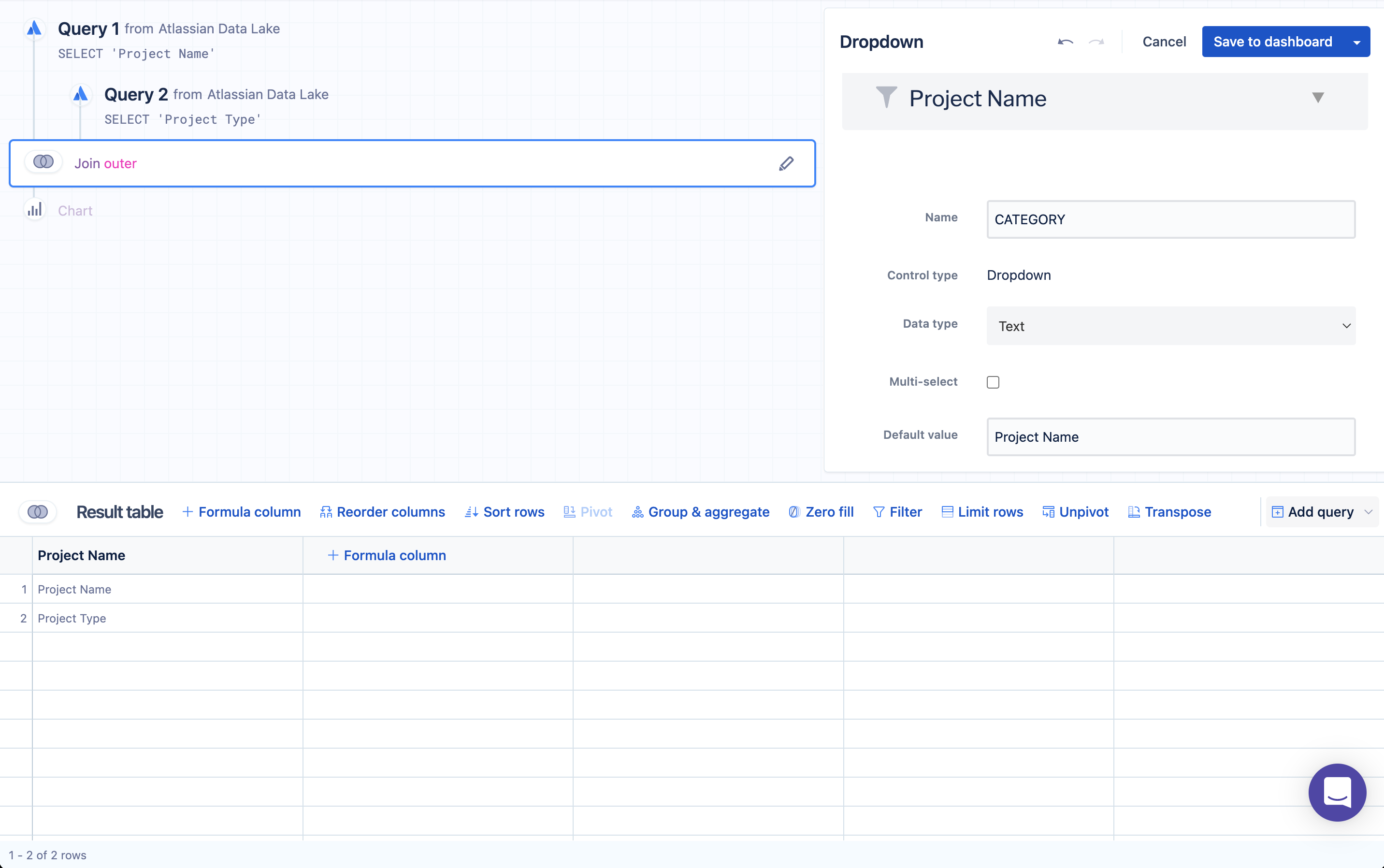
4. Below the SQL editor, rename the dashboard control to something unique like “CATEGORY”. Make sure that Multi-select is unselected. Add one of the category names as the Default value (optional). We’ll use “Project Name” as our default value in this example. Select Save to dashboardwhen done.
5. Next, we’ll create a table chart which is filtered by the “Dropdown” control that we just built. Select Add chart, and write an initial query that includes both categories from the “Dropdown” control, in addition to an aggregated column. Once the initial columns are added, select Run query:
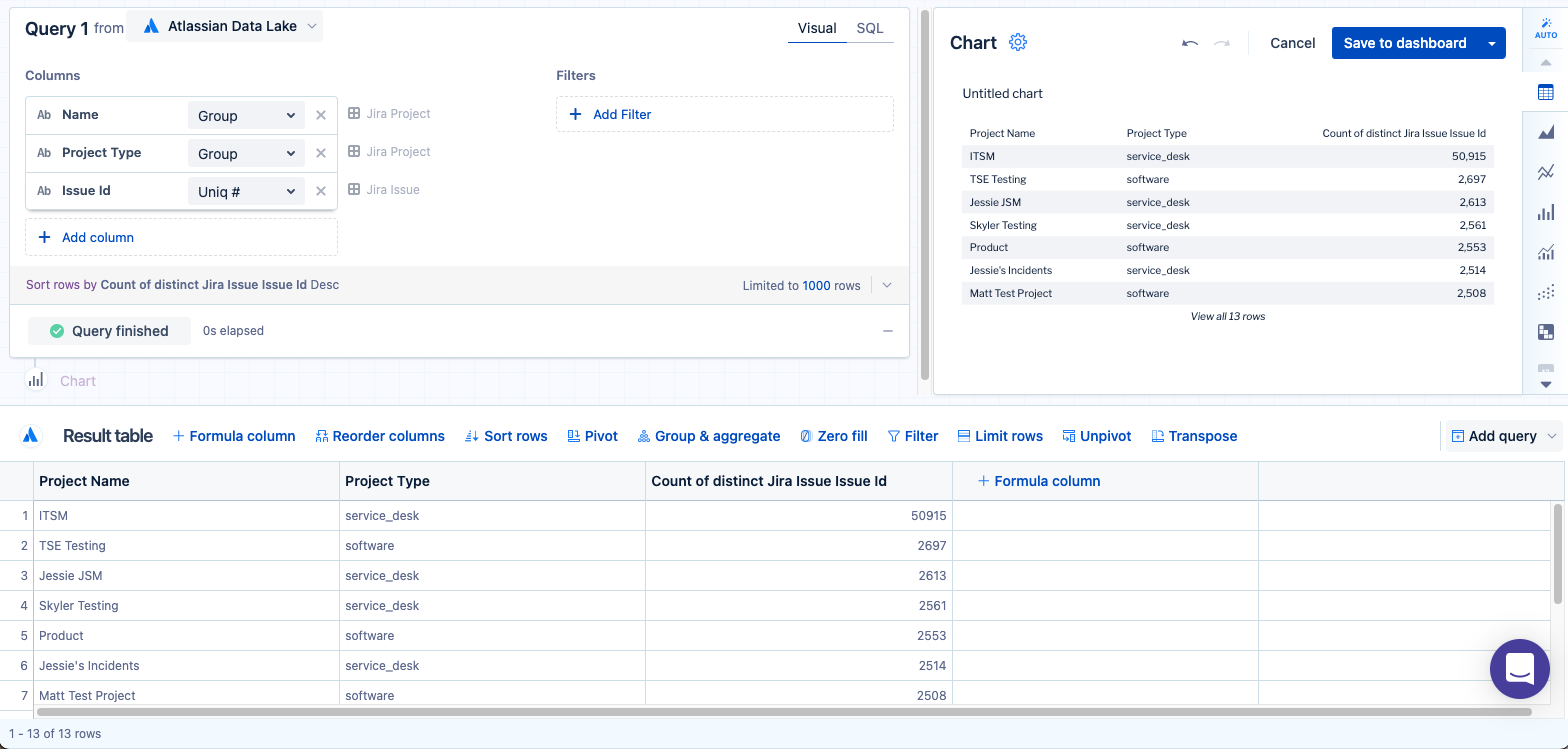
6. Next, we need to add a “Formula column” step. Select + Formula column, choose Custom as the formula type and enter a CASE statement in the formula field. Here’s the one we’ll use for our example:
CASE WHEN {CATEGORY} = 'Project Name' THEN "Project Name" ELSE "Project Type" END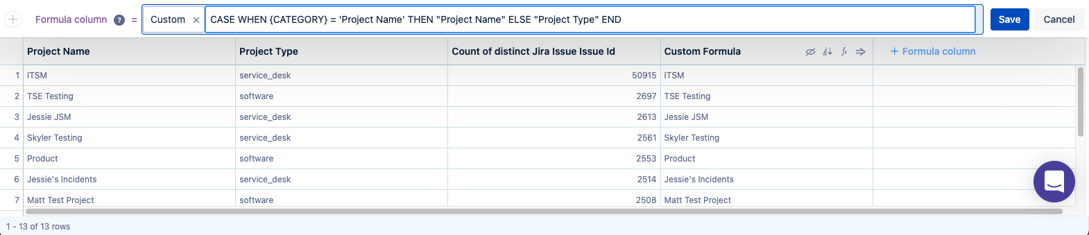
If you have more categorical columns, add additional WHEN and THEN clauses to your CASE statement. Select Save to submit your changes.
7. Apply “Hide column” steps to hide your original category columns in the final chart. In this example, we hide our original “Project Name” and “Project Type” columns. Optionally, you can rename your aggregated column as well. In this example, we rename the aggregated column to 'Count of Jira Issues'.
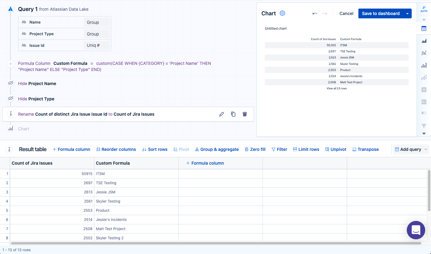
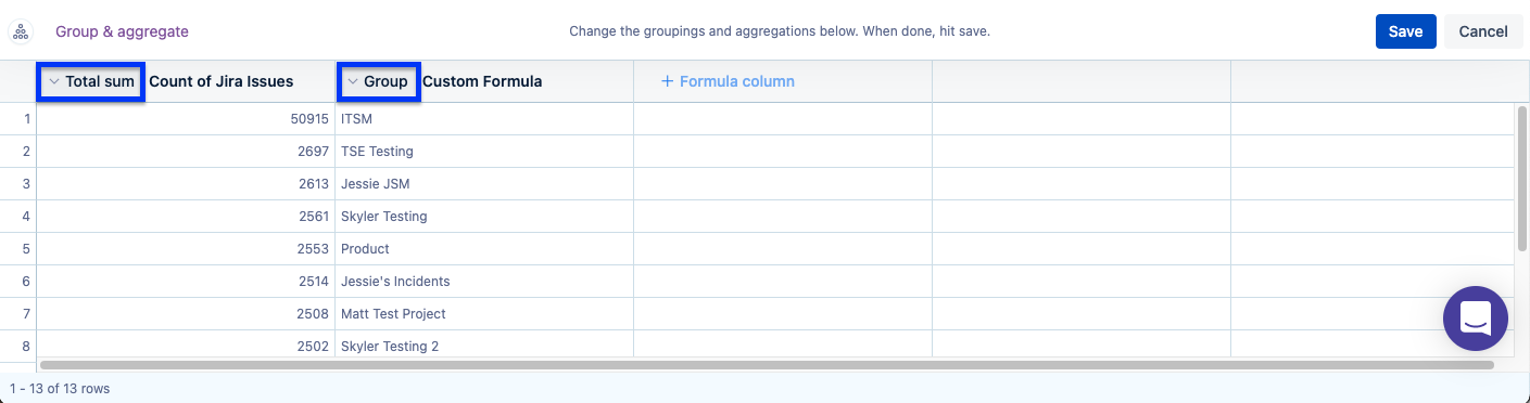
8. Add a “Group & aggregate” step, setting your dynamic category column to use the GROUP option and set your aggregated column(s) to use the Total sum aggregation. Select Save:
9. Reorder the columns so that the “Formula column” is the first column of the “Result table”. Rename the “Formula column” and the aggregated columns as desired.

10. Save the chart to your dashboard, then you’re done!
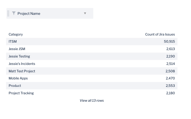
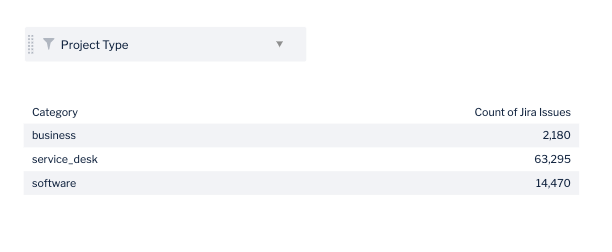
Notice how changing the category using the dropdown control changes the rows returned in your connected table chart.
Was this helpful?